KFC Logo and PNG: Meaning, History, and the Iconic Colonel Sanders Symbol
The KFC logo is one of the most recognizable brand marks in the world. Its bold red and white colors, combined with the smiling face of Colonel Sanders, create a powerful association with quality fried chicken and a long-standing heritage. In this guide, I will explore the history of the KFC logo, its evolution over decades, the meaning behind its design elements, and how brands can learn from its visual identity strategy.
The Origin of the KFC Logo
The KFC brand started in 1930 when Harland Sanders opened his first roadside restaurant in Kentucky. By the 1950s, when Kentucky Fried Chicken began expanding as a franchise, the need for a strong, recognizable logo became evident. The first logo featured the full name “Kentucky Fried Chicken” alongside a sketch of Colonel Sanders. His iconic image quickly became a symbol of trust and home-style cooking.
The earliest version had a black-and-white portrait of Sanders with a bowtie and apron, which emphasized authenticity and a personal touch. Over time, the logo’s design shifted toward simplicity and visual impact to remain effective in modern media formats.
The Evolution of the Logo
The KFC logo has undergone several redesigns, each reflecting both the brand’s growth and changing design trends:
- 1952–1959: The first logo was detailed and text-heavy, reflecting the brand’s early positioning. It included the full brand name and a realistic illustration of Colonel Sanders.
- 1978–1991: The logo moved toward a bolder, simpler design with the introduction of bright red, symbolizing energy and appetite. Colonel Sanders’ face was refined into a cleaner illustration.
- 1991–1997: The brand shortened its name to “KFC,” signaling modernization and faster recognition. This was a strategic shift as the company expanded internationally.
- 1997–2018: The logo adopted a trapezoidal badge shape, placing the Colonel’s image above the bold “KFC” wordmark. This era cemented the Colonel as the core element of brand identity.
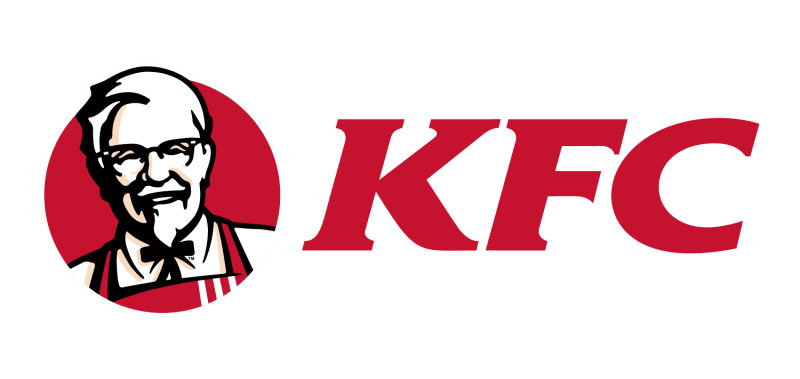
- 2018–Present: The current logo focuses on minimalism, with a modernized illustration of Sanders’ face, clean typography, and a bold red background. This version ensures clarity across digital platforms and high-resolution PNG formats.
The Meaning Behind the Logo
The KFC logo is not just a design; it represents the brand’s values. The smiling Colonel Sanders face conveys trust and a sense of family tradition. Red is associated with warmth and appetite, while white communicates cleanliness and quality. The combination creates a welcoming and energetic brand personality.
The bowtie and apron in the illustration highlight the founder’s culinary heritage, serving as a reminder of handcrafted recipes and attention to detail. This visual storytelling is what makes the logo timeless.
Lessons from KFC’s Logo for Modern Brands
The KFC logo demonstrates how a brand can evolve while staying true to its roots. Each redesign retained the recognizable Colonel Sanders image, ensuring that the brand’s core identity remained intact. For entrepreneurs and startups, this offers a valuable lesson: consistency in visual elements builds long-term brand recognition.
Key takeaways:
- Simplicity wins: Minimalist designs with fewer details are easier to recognize across platforms.
- Colors matter: A strong color palette like KFC’s red and white creates emotional impact.
- Heritage and storytelling: Including elements that reflect a brand’s origin (like Colonel Sanders’ portrait) adds authenticity and trust.
Creating a Logo in the Style of KFC
For those inspired by KFC’s branding, creating a logo with a similar storytelling approach can be done using modern AI-powered tools. Platforms like Turbologo’s AI logo allow anyone to design a professional-looking logo in minutes. By focusing on the right color schemes, typography, and iconic elements, brands can craft visual identities that resonate with their audience and stand out in competitive markets.
Advice from an Expert
Expert Tip: When designing a logo, never copy existing brands. Instead, study how they convey meaning through shapes, colors, and symbols. A successful logo tells a story at a glance and remains recognizable even when scaled down to a favicon or printed in black and white.
Frequently Asked Questions (Q&A)
1. What does the Colonel Sanders symbol represent?
It reflects the founder’s values, emphasizing authenticity, trust, and handcrafted cooking.
2. Why did KFC change its logo to a simpler design?
The shift to minimalism ensures clarity across digital and print media while retaining the brand’s iconic elements.
3. What format is best for a KFC-style logo?
PNG is ideal for its transparency support and high resolution, making it versatile for websites, packaging, and social media.
4. Can a small business create a logo with similar impact?
Yes, by using tools like an AI logo generator, even small businesses can create visually strong, recognizable logos that convey brand values.
This article outlines the meaning and history behind the KFC logo while offering actionable lessons for brand creators. From understanding color psychology to leveraging digital tools like Turbologo, the insights here can guide anyone seeking to build a powerful visual identity.